
This article is intended for business owners and sales department heads who want to use CRM dashboard to improve their sales processes. Customer relationship management (CRM) contains many factors and data points that change regularly, making it challenging to keep up. CRM dashboards, on the other hand, refresh crucial data in real-time, allowing you and your sales team to make the best decisions possible. Using their dashboards to their full extent is a critical component of sales success.
- A CRM dashboard provides your employees with a snapshot of the metrics that are most important to them.
- A CRM dashboard provides a high-level overview of sales activities and key performance indicators (KPIs).
- Consider sales goals, design, KPIs, user-friendliness, and future adjustments while developing your CRM dashboard.
- A CRM dashboard often shows new leads and deals, sales pipelines, key performance indicators (KPIs), and previous and forthcoming activities.
What exactly is a CRM dashboard?
Dashboards are an essential tool of the best CRM software. They provide a high-level overview of your sales activities and essential performance indicators (KPIs). CRM dashboards often emphasize visuals, graphs, and figures over long portions of text. You and your sales team can utilize them to get an overview of the efficacy of your sales pipeline and identify which tasks need to be accomplished next.
CRM dashboards, perhaps most crucially, are highly customizable. This customization allows you to highlight whatever metrics are most important to you and your team. Acquired leads, closed sales, and, of course, KPIs are examples of such metrics. CRM dashboards are also handy for tracking individual sales team members’ progress toward specific goals.
CRM Dashboard Advantages
Some of the reasons a small business might wish to employ a CRM dashboard are as follows:
It keeps your team focused. An in-depth sales report may not always be what your team requires to stay on track to fulfil its objectives. A CRM dashboard’s top-level information can be enough to notify your salespeople what needs to be done now and what can wait, saving them the time and effort of evaluating specific reports.
It simplifies the work of your crew. The report analysis isn’t the only sales activity that takes time; so does report creation. CRM dashboards allow your team to quickly determine which tasks should be completed first without navigating your CRM software to pull reports. This function can save you a lot of time.
It is constantly updated. A CRM report is a fixed document that inflexibly delivers data for a specific time. On the other hand, a CRM dashboard rapidly responds to and reflects changes in your data. As a result, your team may develop its strategy based on the most recent KPI data rather than old figures.
Overall, it leads to more effective sales procedures. CRM dashboards improve overall sales success by putting your sales team’s efforts into the present tense. CRM dashboards are highly effective in guiding your sales team because they provide a picture of your sales pipeline and prospects’ progress, which is significantly more valuable to your team than data from an old report.
What should a CRM dashboard contain?
You should include the following components on your CRM dashboard:
Your sales pipeline. Your CRM dashboard should show you the status of all your pending sales opportunities based on where they are in the pipeline. It should highlight active deals, ageing leads, lost deals, and urgent needs. Your sales pipeline widget will frequently look like a series of horizontal bars displaying the total value of all deals for each pipeline level (e.g., $10,000 in potential post-proposal sales).
Your most recent leads and closed deals. CRM dashboards frequently offer leads and deals as a proportion of total sales value across all reasonable prospects. In other circumstances, your dashboard will display a list of newly generated leads and deals. With either configuration, you’ll know that specific leads require immediate attention to convert to prospects. You’ll also be able to identify which prospects have turned into clients.
Recent activity of your sales staff. Given the volume of calls, emails, and other communications that a sales team might generate in a single day, it can be difficult to tell who has done what and when. This information can be displayed on your CRM dashboard alongside other interactions with leads, such as website visits and social media participation. You can change your strategy if you notice flaws in your team’s approach.
Your most pressing duties A CRM dashboard, like any excellent software interface, should feature a list of urgent jobs and their deadlines. Your tasks should be a mix of manually specified objectives and tasks your CRM automatically recognizes as needs. To auto-generate that data, you’ll typically need to set up CRM procedures for your dashboard.
These are your critical performance indicators. KPIs, maybe the most significant CRM dashboard component, show you the current values of the statistics that are most important to you. Without a clear KPI display, your staff may be unsure which tasks should be prioritized.
What to think about when designing your CRM dashboard?
In addition to the essentials listed above, you should consider the following elements while designing your CRM dashboard:
The most critical KPIs. There is no shortage of KPI’s sales process, and there is such a thing as too many KPIs on a dashboard. You should limit the KPIs on your dashboard to those your team requires an instant picture of to succeed. Follow-up contact rates, average sales pipeline duration, and lead response time are examples of KPIs.
The most critical sales objectives and strategies. The business actions that are directly related to lead generation should be reflected in your CRM dashboard. This could imply concentrating on metrics such as blog content engagement, repeat purchases from current consumers, or sales cycle durations for corporate prospects.
The look of your dashboard. CRM dashboards can include much information, and you may be tempted to go overboard in your dashboard design for the best outcomes. You should resist this temptation by leaving as much white space as possible on your dashboard and using (at most) three colours in your visuals.
How simple your CRM dashboard is to use? A messy CRM dashboard cannot be saved by intelligent design alone. A user-friendly CRM dashboard’s widgets must be organized for immediate investigation. These widgets should also assist your sales staff in understanding the status of each prospect in your sales pipeline. Contextualizing your prospects makes it significantly easier to sell to them.
How to improve your dashboard? You should never complete a CRM dashboard. No matter how pleased you are with the design and setup of your dashboard, you should commit to ongoing testing and modifying it as needed. Ask your staff at least once a quarter what is and isn’t working on your dashboard. Then, collaborate with your salespeople to redesign it for tremendous success.
CRM Dashboard Examples
Here are several CRM dashboard examples and explanations of their structures to demonstrate how the above concerns play out in real-world CRM dashboards.

This Salesforce CRM dashboard sample is complete with graphics that display crucial revenue data and sales rep KPIs. It only uses blue, green, and navy as colours (except in the upper right widget) and leaves plenty of white space. This design, as well as the provision of top-level data (revenue) and more specific information (lead status by owner), fills in many gaps for the user company’s sales team.
Freshworks CRM dashboard displays the user company’s private, field, and internal sales in a pie graph dependent on the status of these deals. Besides, this dashboard adheres to conventional CRM dashboard colour and style rules by using just blue bar graphs and plenty of white space. The icing on the cake is the centre-bottom tool for swiftly adding new or existing reports.
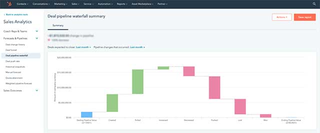
This HubSpot CRM dashboard nicely displays deal pipeline images and numbers for the user firm. The company can use this dashboard to apply various filters to understand sales fluctuations over time. The dashboard features only one graphic and plenty of white space for a clean, straightforward vibe. You can use this dashboard as a model for creating a CRM dashboard that focuses on a small collection of numerical KPIs.
The other examples may be more appropriate if your CRM is primarily focused on various forms of graphical data. Finally, the best CRM dashboard is the one that works for your team, no matter how many changes you make or don’t make.
admin
Taylor Gilbert is the admin and freelance writer at How About Tech since 2020. He primarily writes Tech articles, How-to guides and Entertainment as well.